My Dad’s Journey: How we created an animated short film
Join Davide Rambaldi, Eurochild Communications Coordinator, as he shares in his blog the journey behind the creation of a touching animated short film. Delve into the story of how a team's dedication brought to life a heartfelt narrative on the essential role of fathers in the formative years of childhood.
How can we explain without being boring and paternalistic (pun intended) how fathers are equally valuable in parenting and have the right to be there for their children from the very beginning?
How can we create something that people would watch or read even if they are not already activists, social workers or they work in the child rights sector? These were the questions we asked ourselves while brainstorming for this project. I’m sharing my thoughts hoping it will help and inspire other communications colleagues who are planning to create an animated video.
- The context
The video is done in collaboration with ISSA, Eurochild member and partner of the First Years, First Priority campaign advocating for the prioritisation of early childhood development in public policies and funding. Studies show that children exposed to adversity in their first months and years are less equipped to cope with adversity later in life. Positive experiences during the first years of life are important for healthy brain development.
- Defining purpose
The video wants to increase awareness around the role of fathers and support our advocacy promoting the issue in policies, programs and services.
- A heartwarming story v. cold policy facts
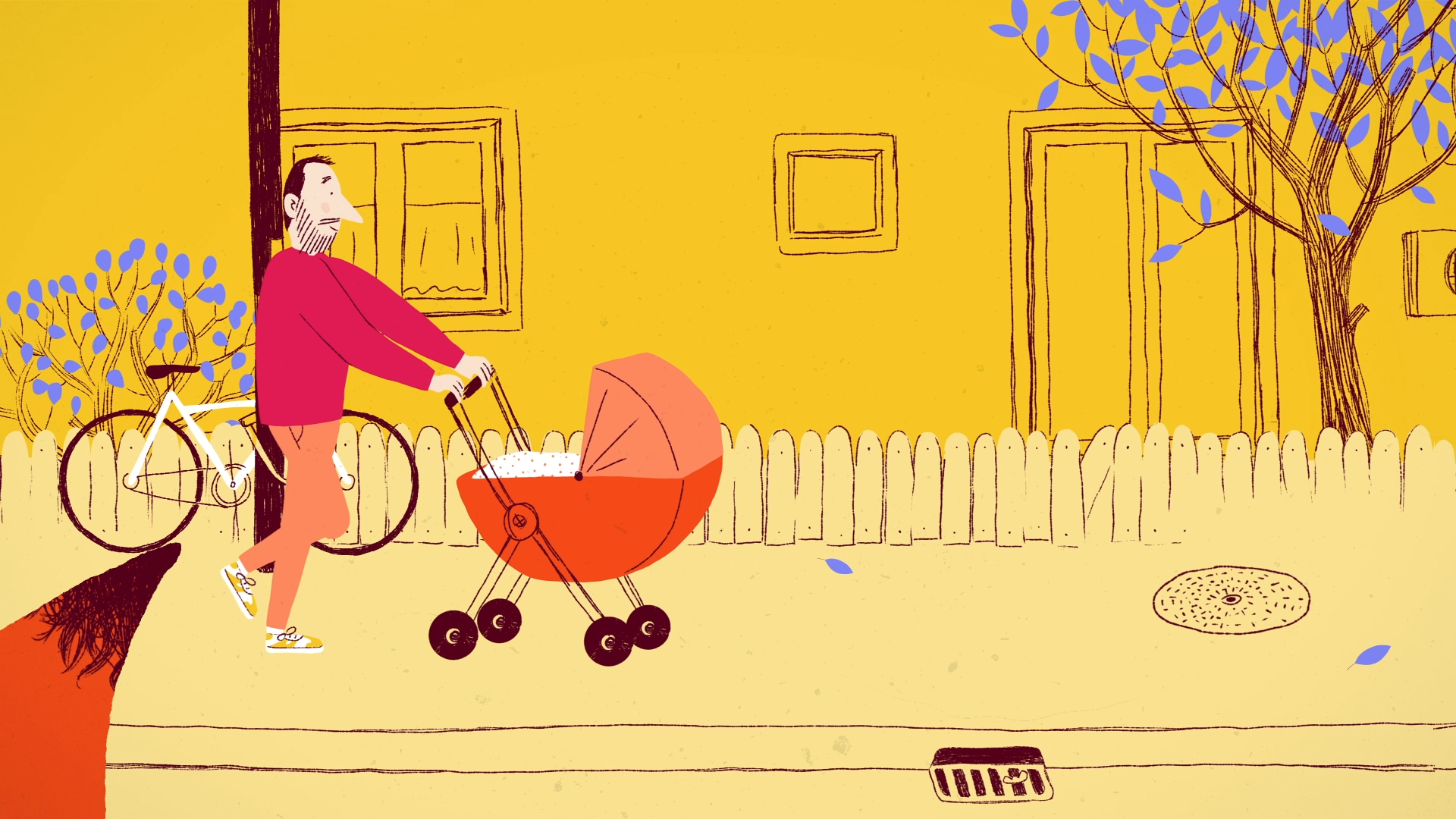
The usual sentence that communications professionals say in Brussels is “let’s go outside the Brussels bubble, let’s reach out to EU citizens, national governments, and families” . That’s correct, but easier said than done. After selecting the best proposal, we focused on two things: creativity and storytelling. Explainer videos, the ones with simple animations, stats and keywords bouncing on a screen are good for quickly explaining topics to people who are already interested in them, the same goes for long YouTube videos that can go deep into an issue because people actively search for a topic. We wanted something different. When we approached We Tell Stories we asked to have something that felt like home, a short story with drawn illustrations and warm colours and not the usual flat icons but scenes painted with simplicity and authenticity.
- Using clear, simple language v. technical EU jargon
We wanted to convey our message simply by showing scenes of a day in the life of a family. No statistics, no EU laws, and no case studies. Simple language and short sentences that would be easy to understand and translate for non-native speakers.
- Putting ourselves in the shoes of other people
I’m one of those people with the memory of a goldfish, but there is one learning that I won’t forget. Almost 10 years ago, while I was a university student, a Public Relations lecturer told us one day: “When you create something, think about who will read it. They’ll think” what’s in it for me?”. Never create content for the sake of creating content, or no one will ever find it interesting enough to read it.
For the script of the video, we selected everyday moments, and scenes that people can relate to, such as telling bedtime stories, preparing meals, and playing in a park. But also, the struggles, the fatigue of combining housework and childcare or the frustration of not being able to explain things to very young children such as the concept of time.
Ok, but in practice?
- The checklist
Embrace transparency, collaboration, and flexibility throughout the process. These are my suggested steps to take:
- Create a concept note and publish the call for illustrators
(share as much info as you can with agencies if you want relevant proposals) - Shortlist the best ones and call them if needed
(make sure to check previous pieces of work they have done) - Sign the contract and organise a first meeting with the agency
(look for clarity of steps and roles and use the meetings to explain what you have in mind and what you expect) - Organise a long brainstorming meeting
(explore all possibilities, ideas, examples and define the call to action and key messages) - Create a work plan with a timeline
(be realistic and define who does what, be flexible and focus on quality if it needs more time. Creative projects need time) - Agree on mood palette, drawing style and rough sketches
(this defines the look and feel of the video) - Create together or give feedback to the script with dialogues and key messages
(make sure to be 100% sure about the text before illustrations are done) - Send feedback to the storyboard/ first raw version of the illustrations
- Provide feedback to the animations
- More changes and fixes
- If children are involved, make their parents sign a Child Protection Policy
- Voice-over recording
- Check and approve the final version
- Prepare for the launch via social media, newsletters, websites, etc
Now get your popcorn ready and watch the video:
Credits
Script: Tom Moylan
Illustration: Vérane Cottin
Animation: Marilyne Bonici
Voiceover: Elisabeth, James Miller
Sound design: Cédric Vanstraelen
Production: Evan Lamos; Joan Roels
Direction: Agata D'Addato, Ayça Alayli, Davide Rambaldi, Emily Henry, Francesca Colombo


